The Student Satellite recently got a new visual identity. The new CVI was created by Bruno Palmik, the artistic director and graphic designer of the SWEEP agency and an illustrator in his spare time. He talks more about the created CVI.

What does CVI mean, and what should a well-made CVI be like?
Corporate visual identity plays a central role in creating brand consistency and clear recognition. Its main task is to keep the brand on a solid and well-thought-out course. Considering that it is a technology brand, the consistency of the visual language helps to highlight the professionalism and quality of the Student Satellite, increasing credibility in the eyes of the target audience.
How did the request to create Student Satellite’s CVI reach you, and what were the initial thoughts that arose in connection with it? What inspired you to create Student Satellite’s CVI?
I was offered to help and, of course, I agreed — knowing how rare the opportunity to work in such a field is, I immediately grabbed it. Instantly, references not only to modern tech and space brands, but also to fictitious trademarks that can be found in science-fiction film technologies and props, started to swirl in my head. The specificity of the field provided an opportunity to create something timeless – a visual identity that would serve the organisation for a very long time if it was applied consciously and consistently.
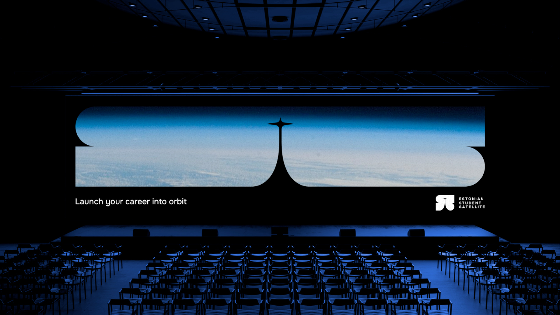
What is hidden in the Student Satellite logo, or what are its elements? Why this particular logo?
The logo mark created during the branding process also allows it to be used as a separate graphic element, thus creating dynamic visuals regardless of the format. The mark has several layers of interpretation: the main shape depicts a stylised S-letter, which refers to both the name of the Student Satellite and the dynamics of planetary movement. The middle part of the shape symbolises the satellite’s ascent into orbit, and a hint of the T-letter is also subtly embedded there.
How long does the process of creating one CVI take?
With branding, it is often the case that everything depends on how quickly this “click” is created – a clear idea or direction from which everything else unfolds. In the case of this visual identity, the concept developed quite quickly, which also provided a solid foundation for the dynamic parts. This is what helped the identity to be easily extended to different formats. It is always a good sign when the created system is naturally applicable and flexible, without setting strict boundaries.
Briefly describe the process of creating a CVI. What is important in the creation?
As mentioned earlier, the entire created system must be easy and intuitive enough to use. It is equally important that the brand book provides sufficient guidelines and flexibility, ensuring that the design options do not run out too quickly. A good identity must be sustainable, providing support today, but also room to grow and develop in the future.
Leave a Reply